
THE TASK
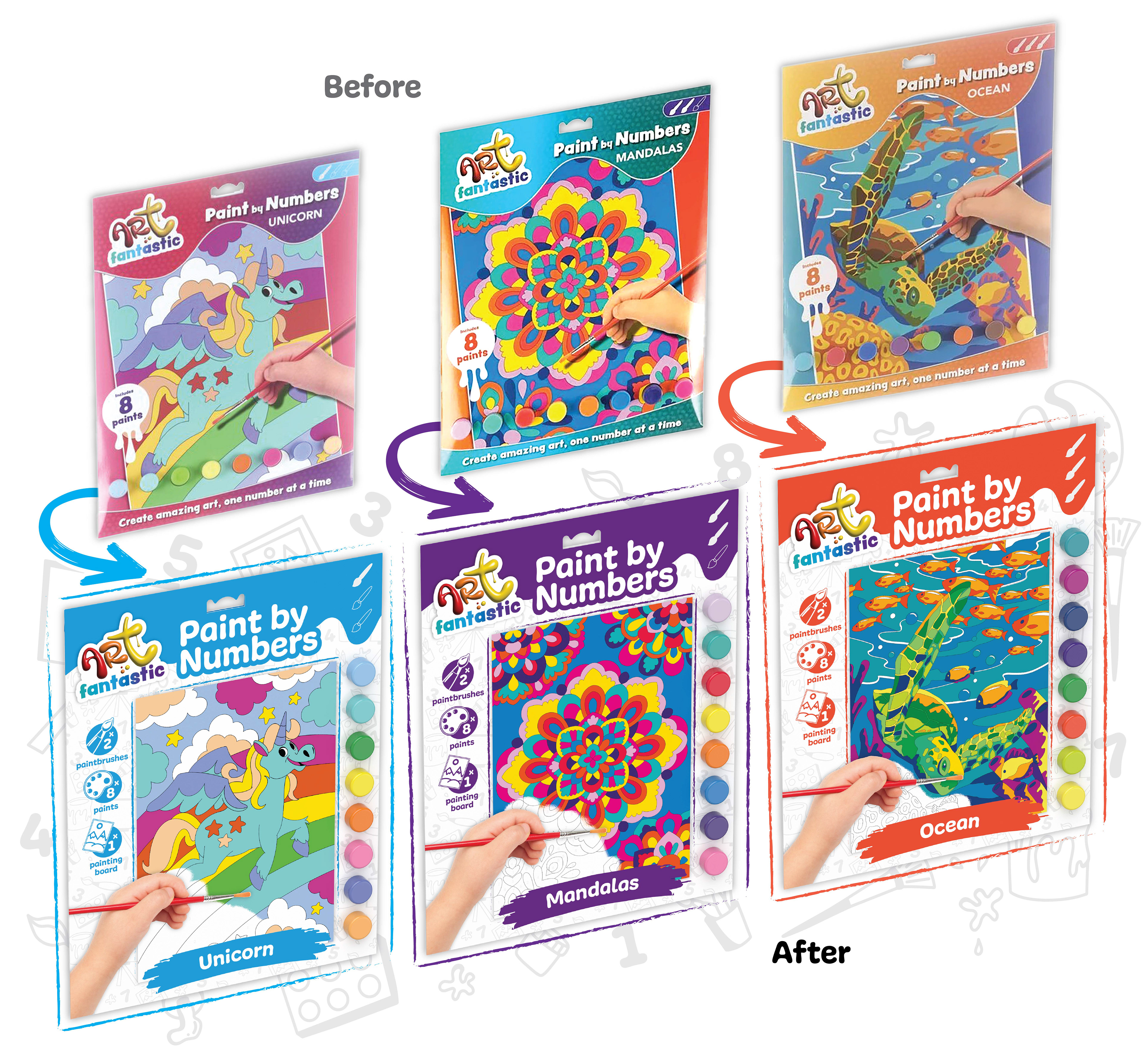
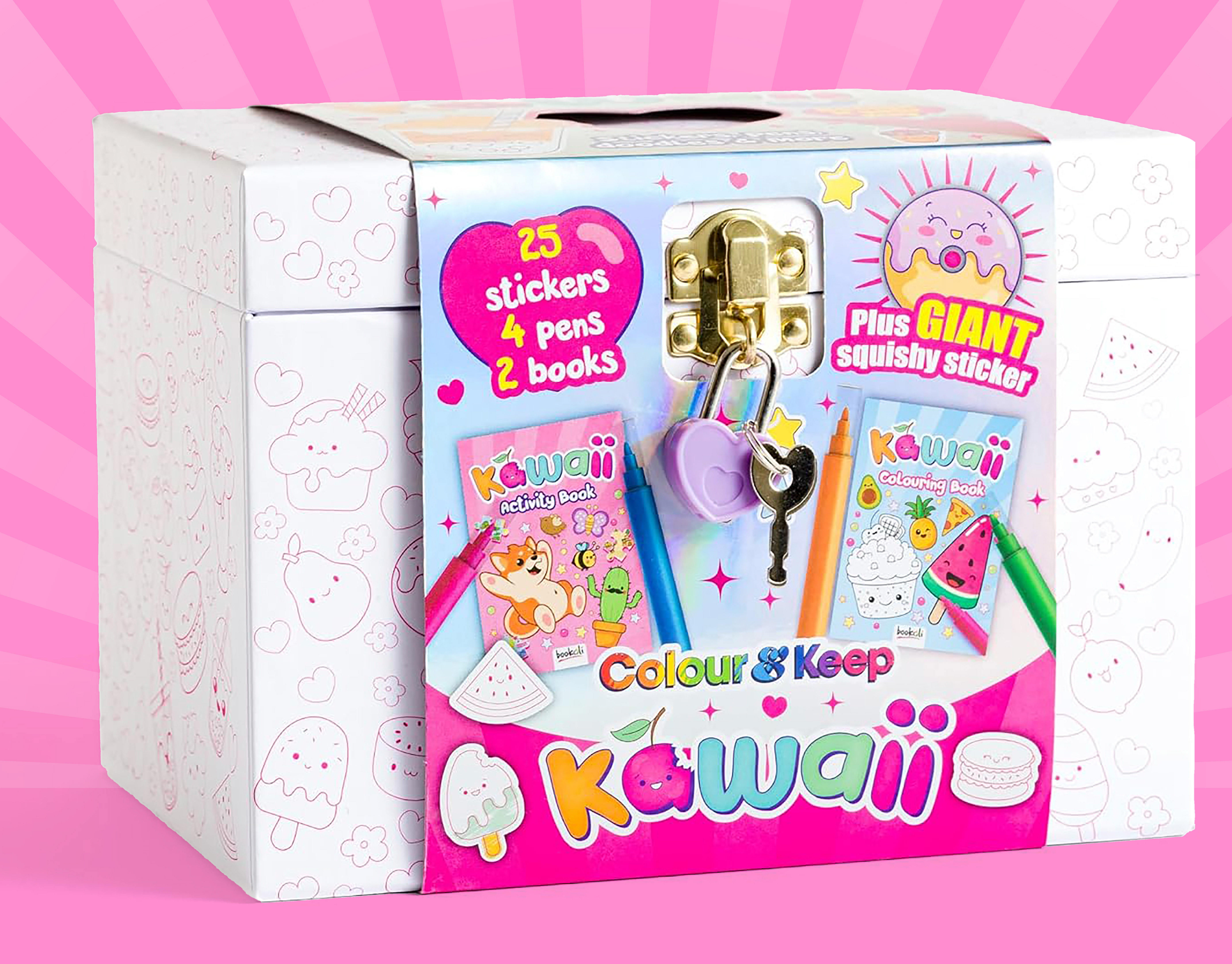
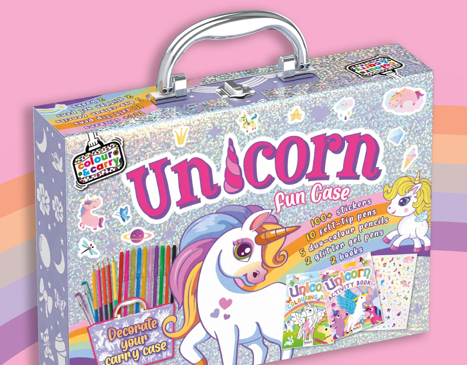
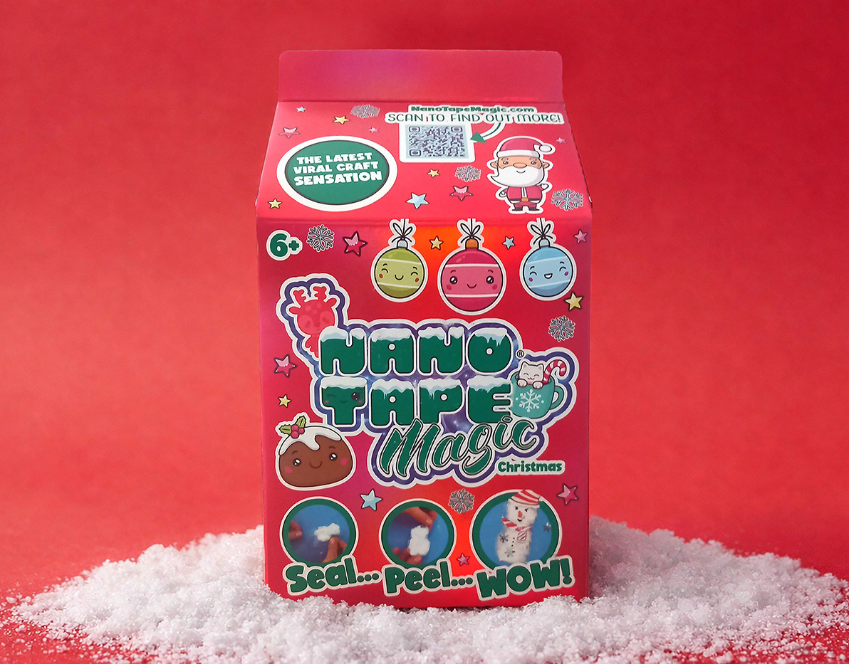
A refreshed pack look was required for this range, with a cleaner visual approach and use of messaging, whilst retaining the interest of a young audience.
HOW THIS WAS ACHIEVED
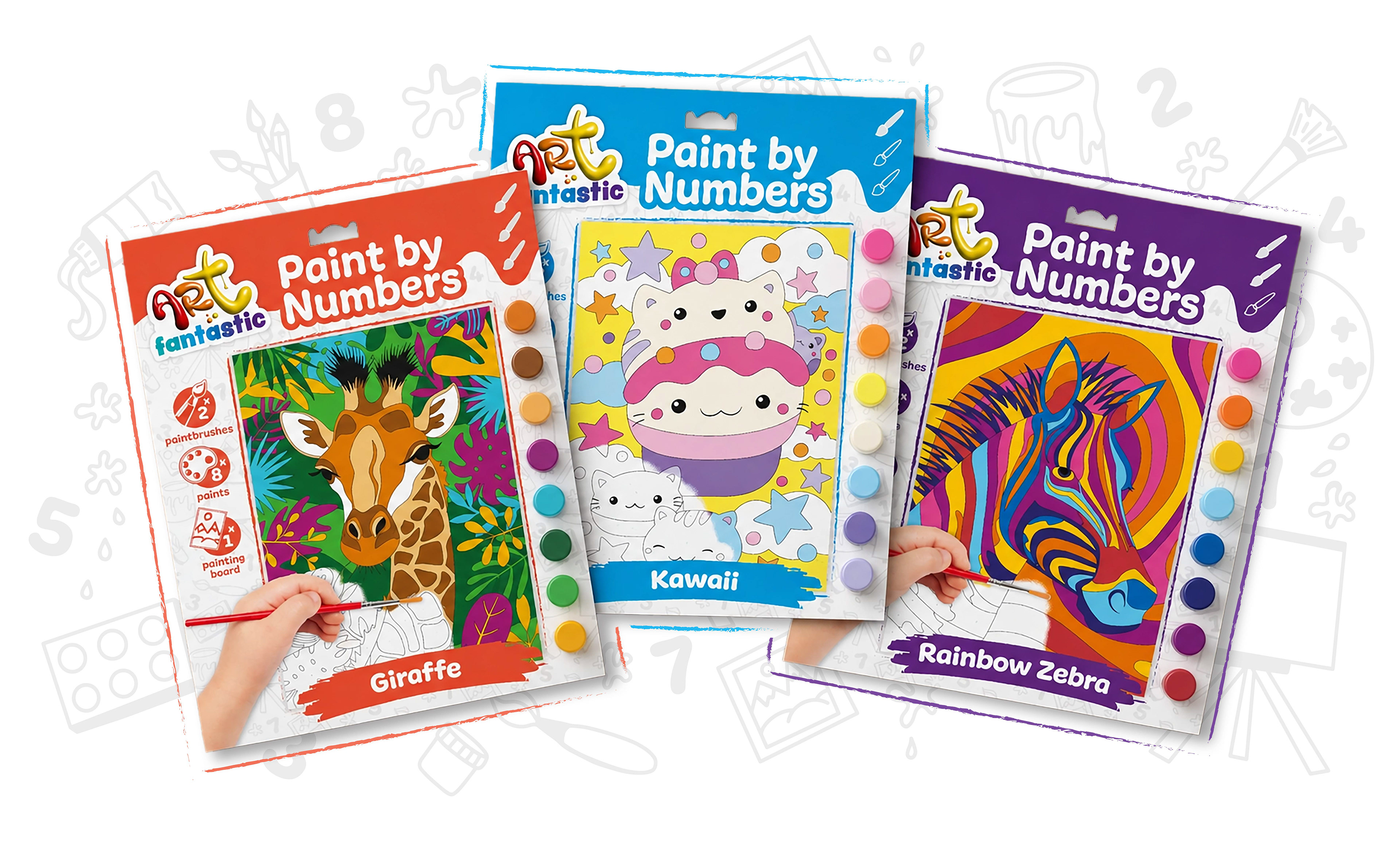
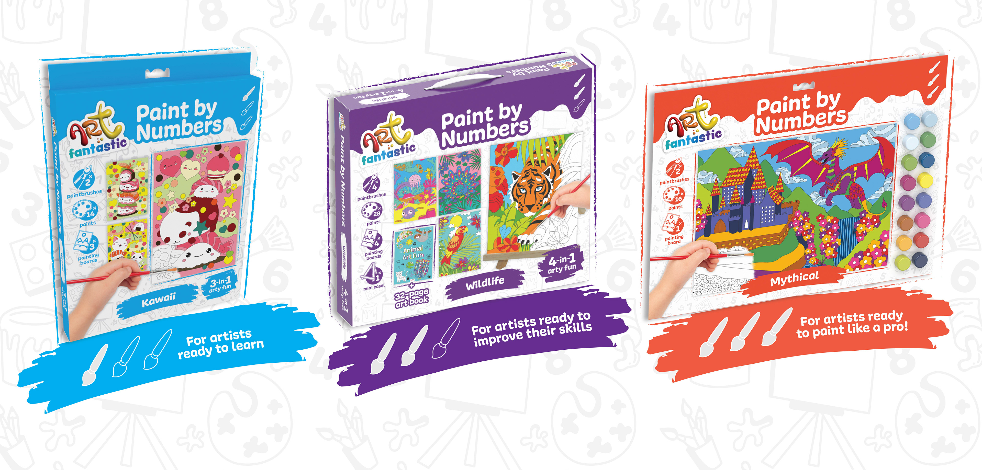
The background and overall colour scheme were stripped right back for a more coherent look across the board, allowing the product to shine on pack. Key colours were maximised on all three different paintbrush levels for quick on shelf scanning for return customers. The messaging was made clearer and more visual with fun iconography shouting out the key features of the product.
A refreshed pack look was required for this range, with a cleaner visual approach and use of messaging, whilst retaining the interest of a young audience.
HOW THIS WAS ACHIEVED
The background and overall colour scheme were stripped right back for a more coherent look across the board, allowing the product to shine on pack. Key colours were maximised on all three different paintbrush levels for quick on shelf scanning for return customers. The messaging was made clearer and more visual with fun iconography shouting out the key features of the product.